×
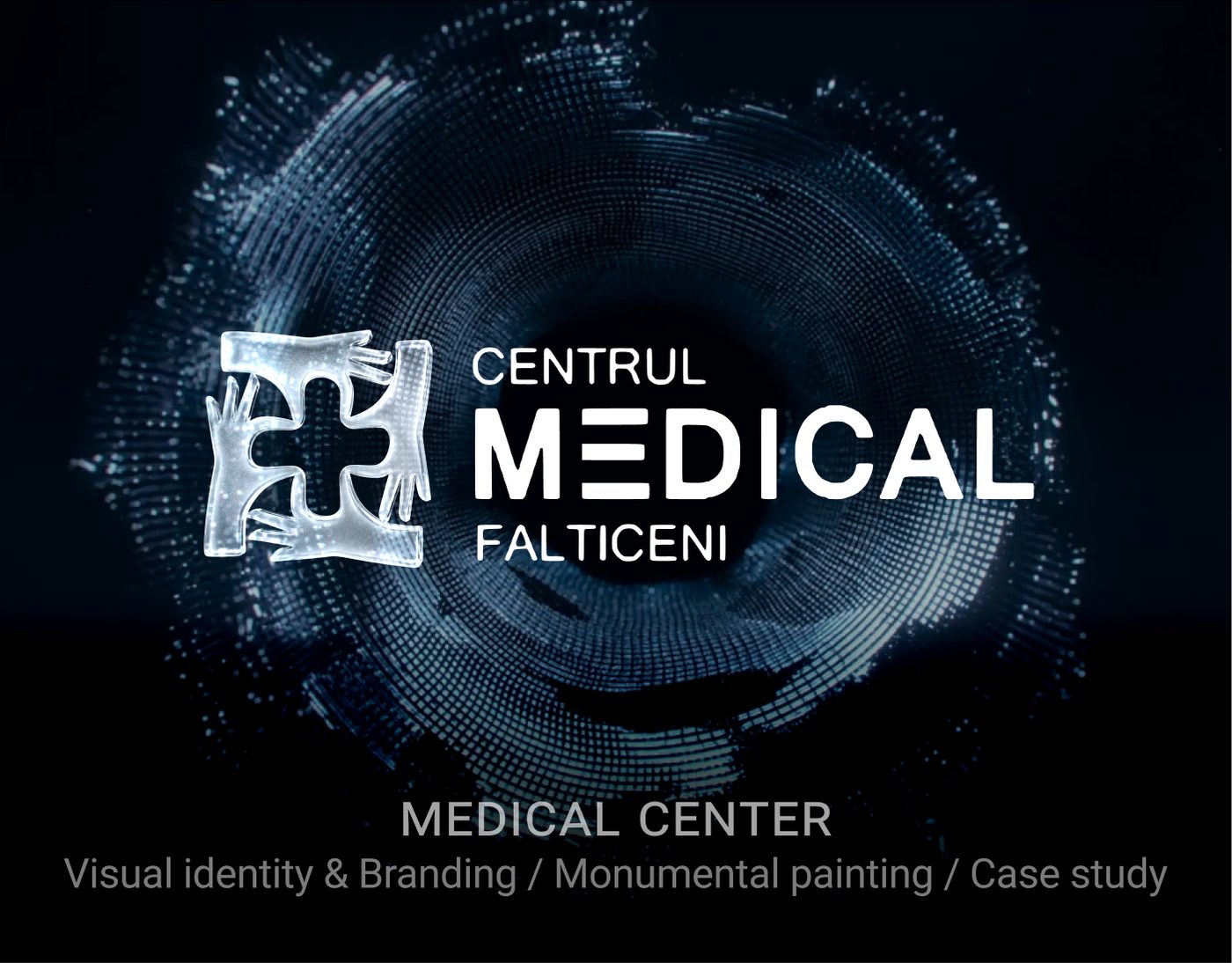
Medical Center — Centrul Medical Fălticeni — Visual Identity · Branding cover

Visual Identity · Branding

Medical Center — Centrul Medical Fălticeni

A clean, trust-first visual identity for a regional medical center.

Role

Brand Designer — strategy, identity system, applications.

Project type

Visual Identity · Branding

Full case study

Medical Center — Centrul Medical Fălticeni — case study visual 1 (UI/UX, product design, Visual Identity · Branding)
Medical Center — Centrul Medical Fălticeni — case study visual 2 (UI/UX, product design, Visual Identity · Branding)
Medical Center — Centrul Medical Fălticeni — case study visual 3 (UI/UX, product design, Visual Identity · Branding)
Medical Center — Centrul Medical Fălticeni — case study visual 4 (UI/UX, product design, Visual Identity · Branding)
Medical Center — Centrul Medical Fălticeni — case study visual 5 (UI/UX, product design, Visual Identity · Branding)
Medical Center — Centrul Medical Fălticeni — case study visual 6 (UI/UX, product design, Visual Identity · Branding)
Medical Center — Centrul Medical Fălticeni — case study visual 7 (UI/UX, product design, Visual Identity · Branding)
Medical Center — Centrul Medical Fălticeni — case study visual 8 (UI/UX, product design, Visual Identity · Branding)
Medical Center — Centrul Medical Fălticeni — case study visual 9 (UI/UX, product design, Visual Identity · Branding)
Medical Center — Centrul Medical Fălticeni — case study visual 10 (UI/UX, product design, Visual Identity · Branding)
Medical Center — Centrul Medical Fălticeni — case study visual 11 (UI/UX, product design, Visual Identity · Branding)
Medical Center — Centrul Medical Fălticeni — case study visual 12 (UI/UX, product design, Visual Identity · Branding)

Visuals © Mihaela Matei — sourced from the Behance case study.

Challenge

Modernise a medical brand so it feels approachable and contemporary while still reading as expert, safe and credible to a wide demographic.

My approach / process

Distilled the brand around clarity, calm and care. Built a system with restrained typography, accessible color contrast, and a symbol that references both the medical cross and human connection.

Key UX / UI decisions

  • High-contrast palette tuned for clinical and digital surfaces.
  • Type system optimised for legibility on signage, forms and screens.
  • Logo construction documented for print, embroidery and digital usage.

Outcome

A complete brand kit: logo, palette, typography, stationery and signage applications, ready for rollout across physical and digital touchpoints.

What this project proves

Brand thinking grounded in strategy — not decoration. Ability to design identity systems that scale across mediums.

Tools used

  • Illustrator
  • Photoshop
  • Figma